Project Objectives
Introduce the Components of Art: Subject Matter, Content, Form.
Introduce Form/Design: Elements and Principles.
Promote visual understanding of the different Degrees of Representation.
Introduce to Element of Design Line.
Promote visual understanding of the Principle of Organization: Unity.
Promote visual understanding of the Principle of Organization: Emphasis & Focal Point.
Project Description
In this project you will exercise ways to abstract from Subject Matter and focus on Form by working with the Element of Design: Line and its characteristics, as well as with the Principle of Organization: Emphasis & Focal Point and its characteristics. You will use a viewfinder to help you find and organize visual elements in order to create dynamic compositions.
Required Materials
Magazines 8" x 10" piece of cardboard HB Mechanical Pencil Sketchbook 9" x 12" Drawing Paper 14” x 17” Bristol Board PITT Pen Set (Black) Eraser Ruler Xacto Knife Cutting Mat Scissors Rubber Cement
Step-by-step Directions
Step 1: Create a 3” x 4” cardboard viewfinder. Use a pencil and the metal ruler to draw diagonal lines across the cardboard. This will define the center of the cardboard and allow you to draw vertical and horizontal lines across the center. Measure and mark 2" from the center on each side of the vertical line. Measure and mark 1.5" from the center on each side of the horizontal line. Still using the ruler and pencil, draw a rectangle using the marks you just created. Use the Xacto knife and metal ruler on the cutting mat to cut off the 3” x 4” the rectangle you created. See How to Create a Viewfinder.
Step 2: Using your viewfinder over the magazine pages, find at least two dozen interesting compositions (24 in total). These should all be non-representational; there should be NO identifiable objects within the frame. Outline the composition with pencil, and then cut out each of them with your scissors.
Step 3: Choose the two (2) strongest compositions. In your sketchbook using pencil, do one thumbnail sketch for each of these compositions. Each sketch should be on its own page and in a 3” x 4” rectangle (use your viewfinder to trace this rectangle quickly). To the left of your drawing, glue the corresponding magazine composition. In a new page, glue the magazine compositions that you did not use. You can glue them one next to the other.
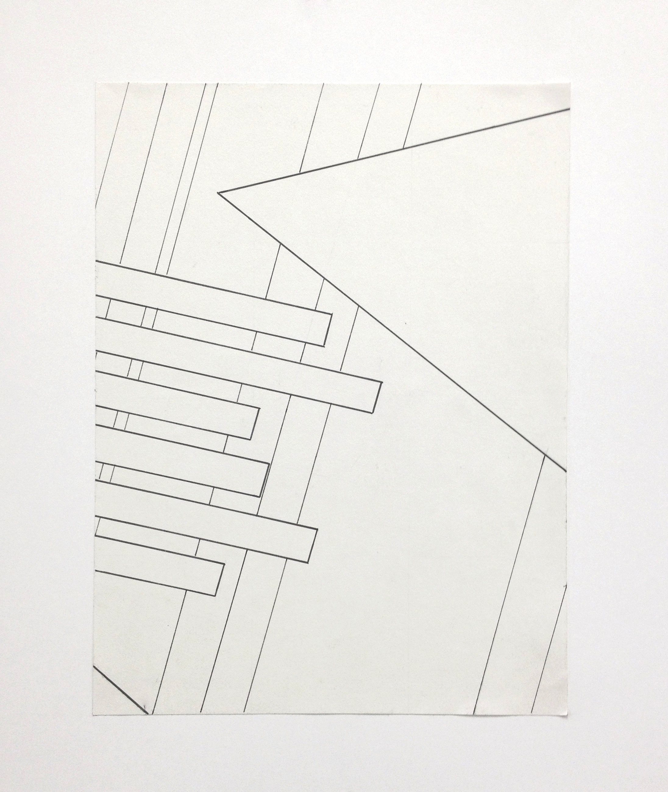
Step 4: Choose the strongest composition from the two sketches. Re-create this composition on a 9” x 12” drawing paper. Use graphite pencils to lightly sketch the dominant shapes of the composition. Then, use the PITT pens to complete the composition by drawing over some of the lines. Only use line, do not shade in areas, or use color. You are looking for the main lines and shapes that create the composition. Use the various pen nib sizes (S, F, M, B) to create variation of line thickness. Your drawing should take up the ENTIRE page, reaching the edges.
Step 5: Mount your final drawing on a 14” x 17” Bristol board using rubber cement glue. See How to Mount Artwork using Rubber Cement. Make sure the drawing is centered on the Bristol board by creating guidelines with pencil before gluing.
Project Considerations
Is the composition non-representational?
Is there a primary focal point?
Has a Visual Flow been established?
Is the overall composition dynamic, yet unified and harmonious?
Does it utilize repetition of line and shape?
Are there any shapes or negative spaces that are not activated within your composition?
CRAFTSMANSHIP is extremely important for each of your designs and is part of the grading criteria. Do not fold, bend, crease, smudge, tear your artworks! Always take great care when creating each design and then put directly into your portfolio case.
What is Craftsmanship? Care in construction and finishing; demonstration of skill and knowledge of processes; attention to detail. The quality of design and work shown in something that is made by hand.
Project Delivery
Created Viewfinder
Presented twenty four (24) magazine cut offs of interesting compositions.
Created thumbnail sketches of the two best compositions.
Presented sketchbook with best two thumbnail sketches and their original magazine cut off compositions.
Presented twenty-two (22) remaining magazine cut offs compositions pasted to sketchbook.
Created final drawing of best composition.
Presented final drawing mounted on Bristol board.
Grading Criteria
This project is worth 3 points.
Project's Grade Rubric
Craftsmanship & Materials: The final design has been executed in a professional manner.
The designated materials are intentionally utilized with care, effort, and attention to detail - cut, pasted, and properly mounted to Bristol Board. 3” x 4” Viewfinder was created and used. Required paper sizes and pens were used.
Elements of Design: The design is abstracted from subject matter through the use of interesting lines characteristics, especially directional lines, positive x negative space.
Composition & Principles of Organization: The composition utilizes the whole picture plane, contain a clear primary focal point and adhere to the rule of thirds. The design is asymmetrical and establishes an intentional understanding of unity (Continuity, Repetition, Alignment, Proximity), utilizes emphasis and focal point through the usage of contrast, convergence, isolation, placement and the unusual.
Extra-credit Sketchbook is worth 1.25 points:
Presented sketchbook with best two thumbnail sketches and their original magazine cut off compositions. (0.75)
Presented remaining 22 magazine cut offs compositions pasted to sketchbook. (0.5)

