Objectives:
Develop visual understanding of how colors relate.
Before you Start:
Go through Intro to Color Presentation and watch the videos below.
What is Color?
How We See Color
Color Only Exists in Your Brain
Discovery YAFI -- Colours of Light
Complementary Color Chart - Prof. Mahr | Note the video example is in Acrylic and our exercise is in Gouache which uses less paint.
You can find more videos about Color in the course Video Resources page.
Exercise 3 | E-portfolio
Upload to Brightspace
Media & Support:
- Pencil
- Gouache
- Paint Brushes
- Mixing Palette (egg carton)
- Container for Water
- Compass, Ruler, Protractor
- Xacto Knife & Rubber Cement
- 9”x12” Drawing Paper
- 14”x17” Bristol Board
- Color Studies Template
Considerations:
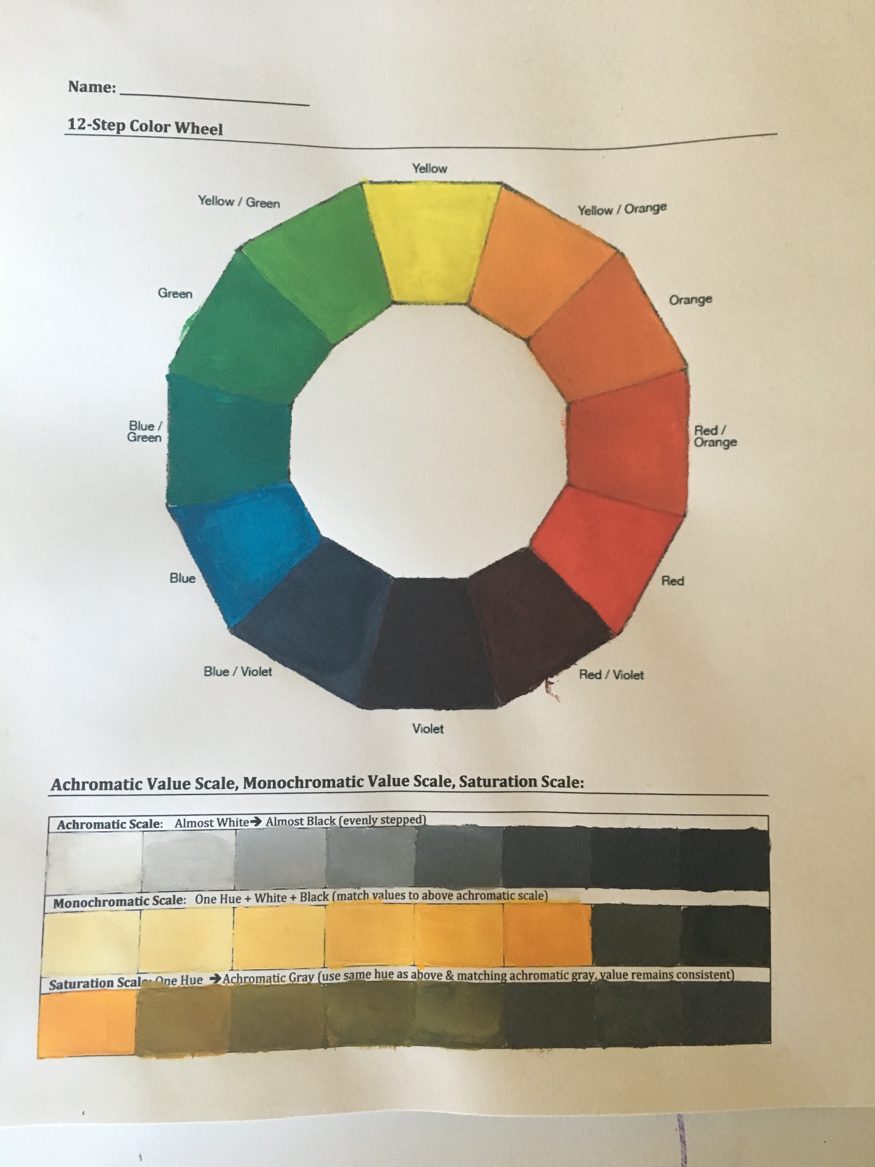
This exercise has different parts: a color wheel, a value scale of one hue, and a complementary color scale. Each of these will be mounted on the same piece of Bristol Board.
Development:
Part 1 | Color Wheel
Step 1: First paint in your primary colors (Red, Blue, Yellow)
Step 2: Only using your primary colors, mix the secondary colors (Orange, Green, Violet) and paint in the appropriate area.
Yellow + Red = Orange
Yellow + Blue = Green
Red + Blue = Violet
Step 3: Only using your primary colors, mix the tertiary colors and paint in the appropriate area.
(Yellow + Red = Orange) + Yellow
(Yellow + Red) + Red
(Red + Blue = Violet) + Red
(Red + Blue = Violet) + Blue
(Blue + Yellow = Green) + Blue
(Blue + Yellow = Green) + Yellow
Part 2 | Achromatic, Monochromatic and Saturation Scales
Step 4: Achromatic Value Scale Paint an achromatic value scale from nearly white to almost black using only white and black.
Step 5: Monochromatic Value Scale
- Choose a Hue from your color wheel
- To figure out what value (1-8) your hue is, compare it to the achromatic value scale that you created on Step 4: Achromatic Value Scale. All hues have their own inherent value.
- Paint in the hue where it belongs on your value scale.
- Then paint the first box (value 1) white and the last box (value 8) black.
- Add white in increments to your hue to fill in the boxes between white and your hue.
- Add black in increments to your hue to fill in the boxes between black and your hue.
- Make sure each shift in value is equal.
- Repeat if necessary to achieve the best results.
Step 6: Saturation Scale: Paint the left box with the same color used in the monochromatic scale. In each of the following boxes, gradually de-saturate the color with its corresponding achromatic gray. The last box should be painted with only the achromatic gray. Use either the complementary color or the related gray to de-saturate the color.
Great visual demonstration narrated in Spanish
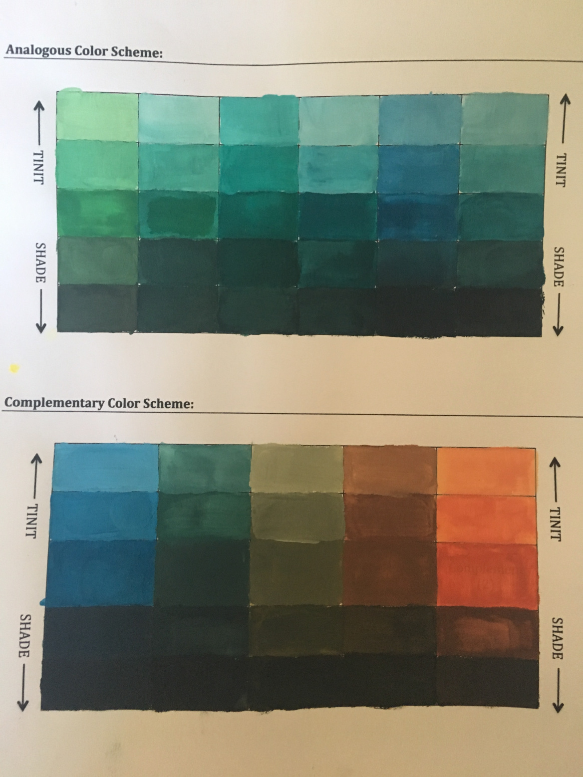
Part 3 | Analogous Color Palette
Step 7: Choose 3 adjacent colors from the color wheel and paint directly on boxes labeled 1, 2, 3 in the same order that they appear on the color wheel. In the appropriately labeled boxes, mix together the analogous colors to achieve more subtle variations. In each vertical column, tint (with white) and shade (with black) each of the colors in row 4 to create full value scales for each (almost white to almost black).
Part 4 | Complementary Color Palette
Step 8: Using your pencil and ruler, draw out your 5 step complementary color scale. The entire value scale should be 5 inches long and 1 inch tall. Then divide the rectangle into 5 one inch squares.
Step 9: Paint in your 5 step Complementary Color Scale:
- Choose a Hue from your color wheel and find its complement.
- Paint the first box with your chosen Hue, then paint the last box with its complement.
- Mix in equal parts of the two colors; paint your middle box.
- Mix your Hue with a little bit of its complementary color, and then paint the second box.
- Mix your Complementary color with a little bit of the original Hue, and then paint the fourth box.
- Make sure that each box has an equal shift in color.
- Repeat if necessary to achieve the best results.
Step 10: Let it dry
Grading Criteria:
Exercise 4 | Color Studies - worth 6 points.
• Delivery of all color schemes applying painting skills and paying attention to craftsmanship (up to 6 pts)
Resources:
Template: Color Studies
Presentation: Color Studies
Working with Gouache
Sample